Hello, everyone this time around I have a special collaborative post for all you readers. Tia, who runs a Graphic Design blog, and I have teamed up to bridge the subjects of our two blogs into one collaborative work. Our topic as you might have already guessed is prejudiced in media design.
Most Americans know that prejudice is limited but still very visible in today’s society and in the 20th century it was even more visible. Women’s rights activists fought for their rights as early as the 19th century, and civil rights didn’t begin until the 1960s, so before then there were a lot of offensive themes in various advertisements at the time. Below are some examples of media and advertisements portraying African Americans and women in a negative light.

Intel (2007) – This is an example of a poorly executed ad. It shows a white male standing upright while six identical black men are in a head start position. Perphaps it was for symmetry’s sake but the fact that this designer made the black men all identical just marginalizes black men’s capacity for individuality. Furthermore the ad relies and upholds the stereotype of black men’s superior athletic capacity, creating a false standard for black men. However, what really makes this ad problematic is that it shows black men bowing to their superior boss,the white male. The ad blew up on the Internet with backlash as it mocked the idea of slavery.

Hoover (1950) – ‘She’ll be happier with a Hoover…’ This is a classic sign of the woman being strictly domestic. A housewife, maid, and nothing more. There are many other examples of this theme as the woman and a household appliance are a common example of sexism in 20th century advertisements. The problem with this design is the sexist language that makes it seem as if a woman will be happiest with a domestic product.
Commercials, television programs, and films will tend to apply social class to only a certain kind of woman.Take a look at this design for Holli Would from the animated and live action film Cool world:


By taking a look at her clothes, makeup, and hairstyle we can see she has an has an overall wealthy looking appearance. She also has exaggerated curves and prominent sex appeal. There are two problems here first is the obvious hypersexualzation in Holli Woud’s design which creates unattainable beauty standards for women and unrealistic expectations for men. The second is the continual association of beauty and sexual appeal with wealth. As if only wealthy women can be beautiful. However, there is a contrast to this: she is drinking a bottle of beer. Beer is commonly shown as a working class drink. Usually working and homeless people drink beer, so this is an odd way to portray a somewhat wealthy woman. Perhaps it’s because she is also promiscuous as if diverging from sexual purity is also diverging into a rougher lower class life style. This is also problematic because promiscuity and alcohol consumption are seen as the lifestyle of the working class.
Finally, let’s talk about a good character design.
: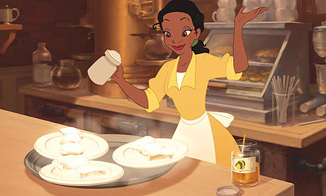
Tiana is a diverse character but for this post I would just like to concentrate on her class representation. Tiana is a truly great representation of the working class. Tiana is designed to be a hard working woman. She has two jobs; one as a waitress and another as a cook. She is saving up to open up her own restaurant. Tiana’s work is designed exceptionally well by contrast to her best friend Charlotte the daughter of the rich mayor. Charlotte gets anything she wants from her rich father and could probably have opened Tiana’s restaurant with the money she uses for her dress. In other words Tiana has two work twice as hard and long for anything she wants, this is an accurate representation of the failures of our class system. The actual design of Tiana is a bit disappointing, however. The problem is that there are no visible signs in her physical appearance that might indicate her hard working life. As a working woman with two jobs you might think that she would have more muscles in her arms or bags under her eyes. Anything that shows that she has to work harder than others.
It is well known that media design can range from persuasion, advertising, entertainment etc but things begin to get problematic when these designs incorporate prejudice. Therefore the designer has a burden to be aware and educated of the representations they might be portraying.
 Graham Slaughter recently wrote